The new avatar does justice to the Zopper’s identity and scope of business
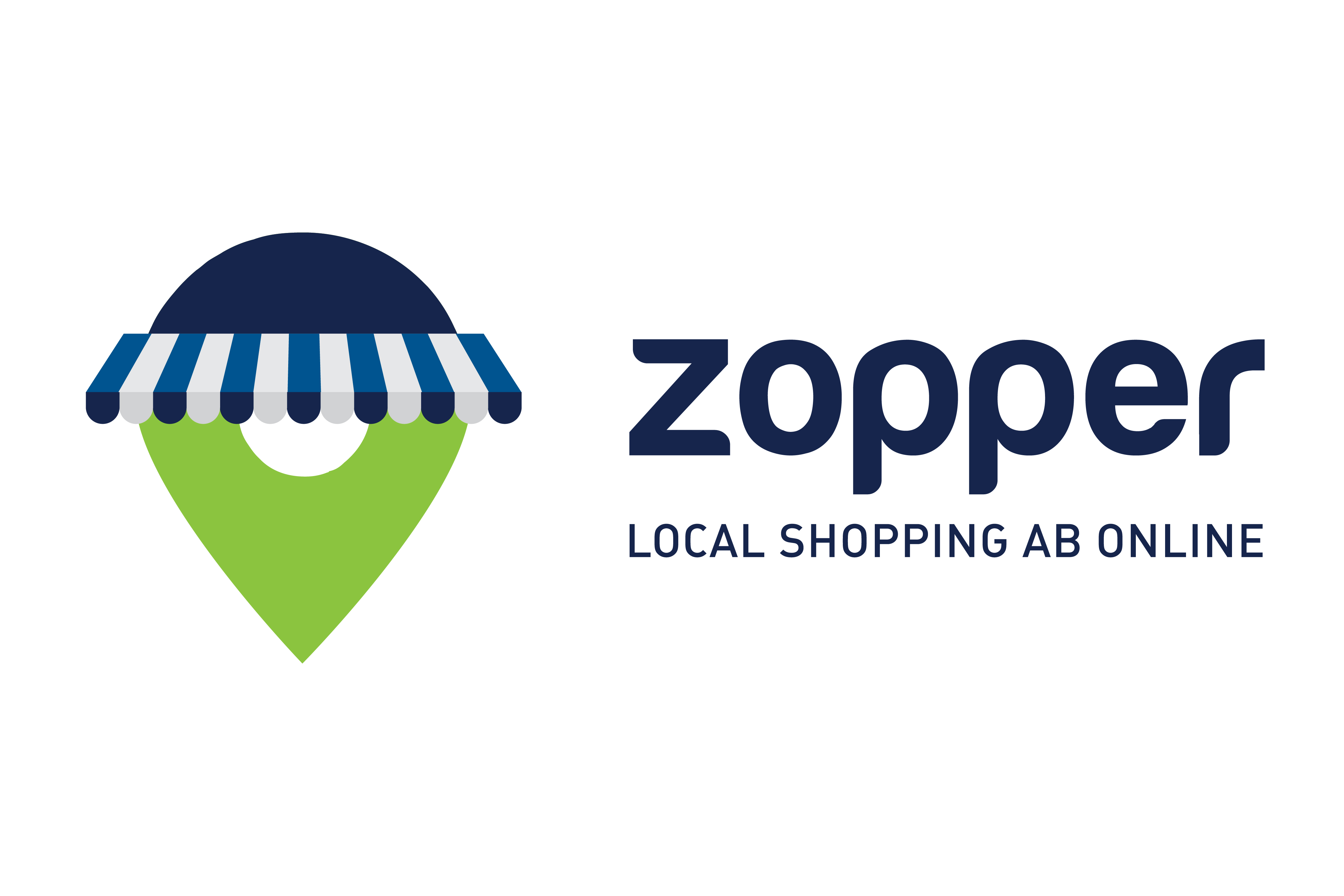
Evolving in the course of time, Zopper, India’s leading hyperlocal 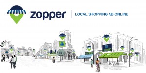 marketplace recently unveiled its new brand positioning and new logo. The redesign is meant to emphasise what the brand fundamentally stands for – combining the best of Online and Local shopping.
Commenting on the revamp, Harneet Singh Rajpal, CBO, Zopper said, “We have come a long way in last couple of years. Our hyperlocal marketpalce where we bring local retailers on board to particiapte in e-commerce has seen great success. We also launched two new pillars of our business- Zopper Assure extended warranty and EasyPOS software platform. With all these we felt it was time to give the brand Zopper a makeover to bring alive the full picture for customers and retailers. The new positioning is basically about brining the best of Online and Local shopping together. The new vibrant colours and logo bring alive the energy and passion with which we are building the brand and business in a sustainable manner. We believe that the new positioning and logo will help us to uniquely establish Zopper in consumers mind. ”
He added further- The customer dilemma of forcefully choosing between variety, convenience available online and the trust, peace-of-mind of local stores has been there for long now. With every innovation by other e-commerce players, both these worlds have gotten further isolated and distant, making shopping a game of trade offs. Zopper was conceived to bid adieu to this dilemma with our hyperlocal shopping model and to connect these two worlds together seamlessly. This is how we bring out the best from both online and local shopping for our customers.
While we have been on journey for a while now, we believe time has come to re-energise the brand positioning, the look and consumer communication to clearly spell out what we bring to them and what we stand for. We are going to represent our ethos in the form of a new logo and new brand strap line. The icon in our logo is a union between an awning, symbolising the trust of local stores & a location pin, the online bearing of our hyperlocal identity. Together, they form the unique core of Zopper, which is make shopping free of compromises.
Over the last year, we’ve grown from being a hyperlocal shopping website to creating a full ecosystem around Electronics category and Retailers. With EasyPOS and Zopper Assure, we’ve empowered our business partners and connected with our customers end-to-end. The combination of our Hyperlocal marketplace, EasyPOS and Zopper Assure has created a very unique business positioned for sustainable success.
Behind the scenes, we are a young tech brand buzzing with ideas. Our new contemporary brand colours are an attempt to reflect our cultural DNA. The Blue connotes precision and intellect that goes into our technology and also the loyalty with which we associate our partnerships. Green, being the colour of equilibrium, symbolises freshness of thought and a balance in everything we do, right from a new concept to integrating diverse ideas. The fluid typology signifies flexibility and openness to change for the better.


