On the occasion of its sixth anniversary, Hyderabad-based  event technology and online ticketing platform meraevents.com has launched its new brand identity / logo.
The launch of new brand identity by MeraEvents synchornises with the gala season that’s opening up across the country with some large-ticket entertainment events like Vh1 Supersonic Arcade Skrillex trour, Enchanted Valley Carnival’s Tiesto show, and, of course, the Vh1 Supersonic Goa festival in December
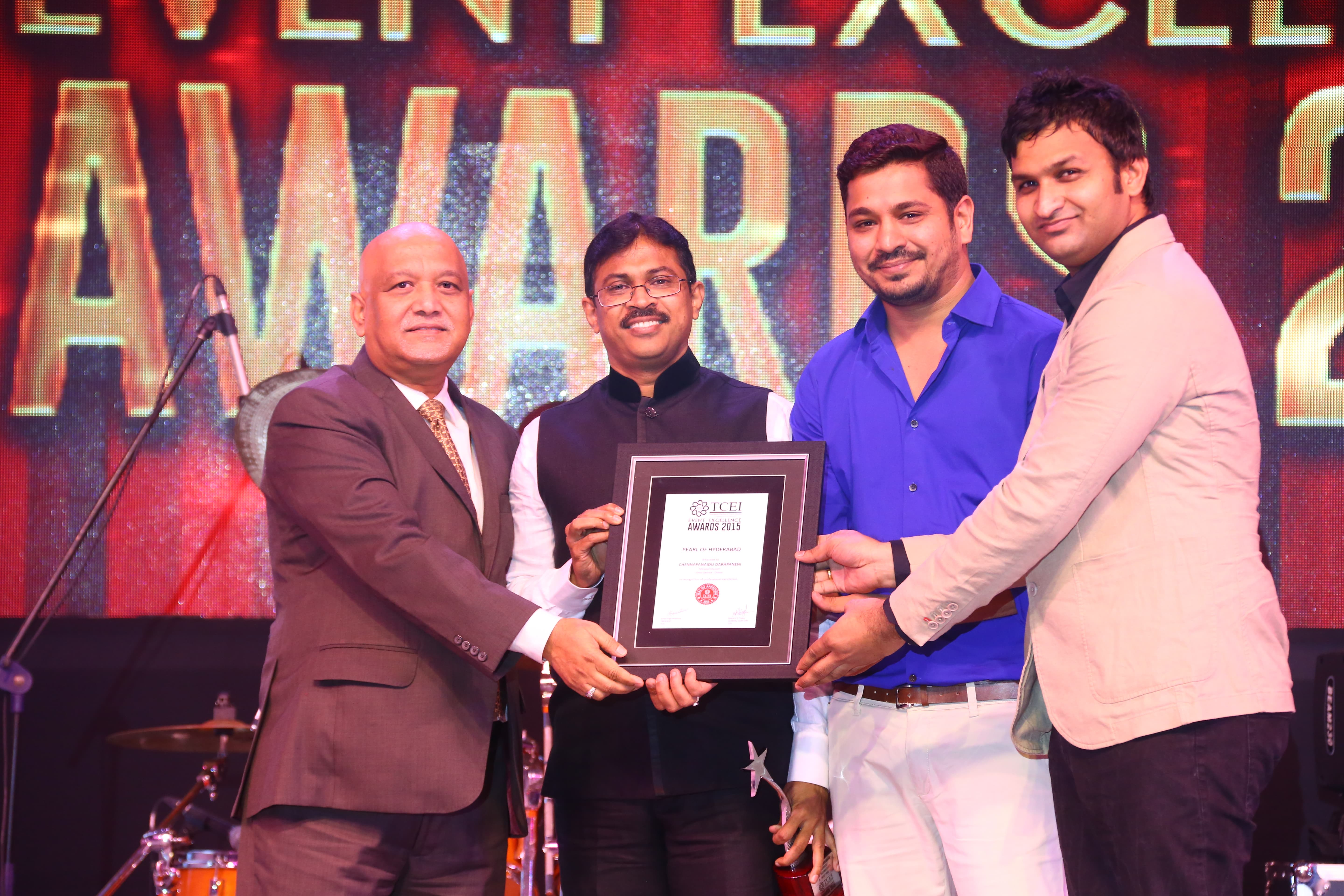
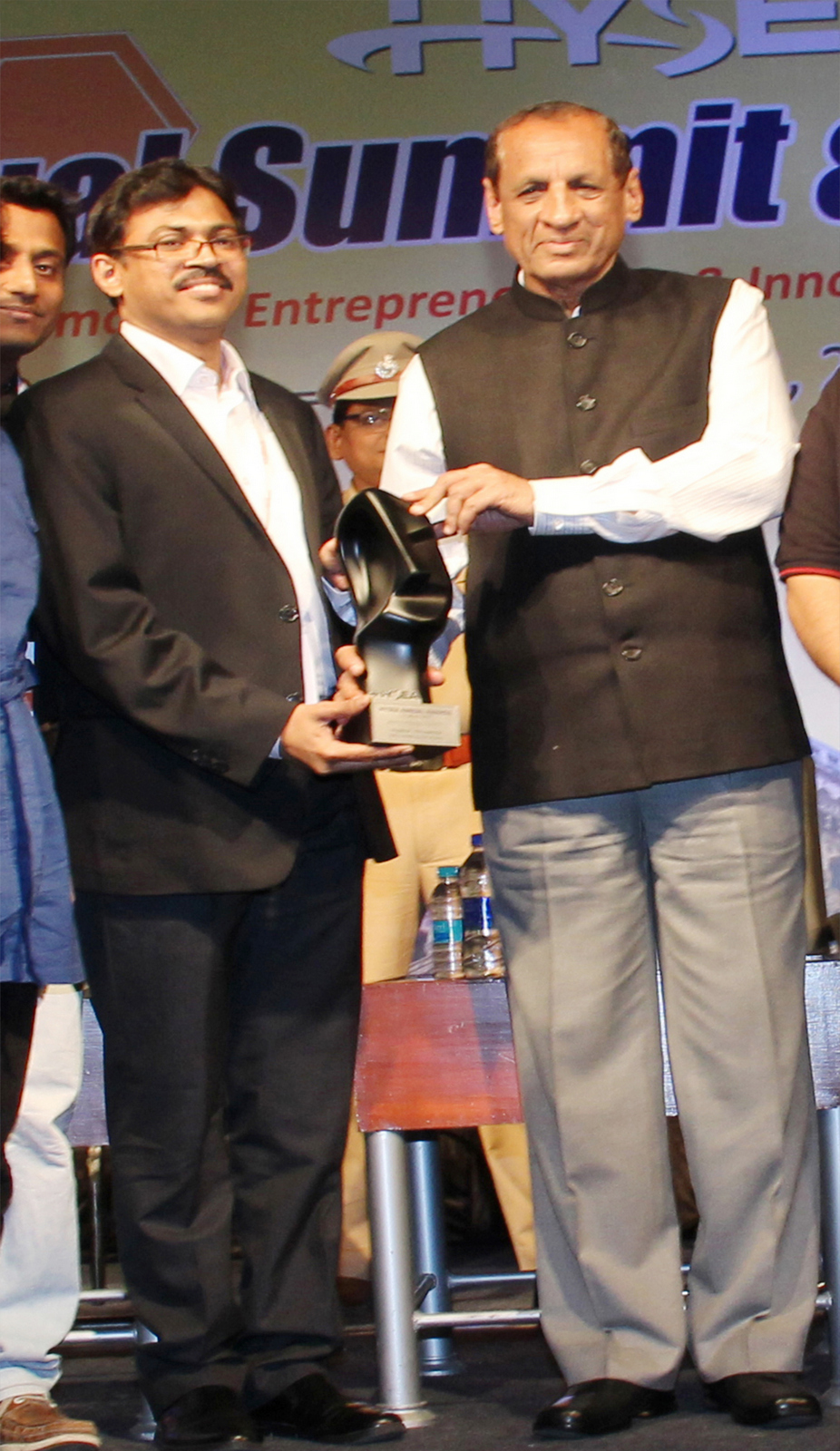
“The logo is just the beginning of a series of new changes to come, and we are only getting warmed up for the events season,” said MeraEvents founder & CEO Chennapa Naidu Darapaneni.
MeraEvents wants to communicate three major aspects through the new identity (Loud, Bold & Reliable). The yellow background and the size of trumpet indicate being loud. The font is bold and the whole aspect of using an English mascot in itself represents that the new identity is indeed bold. In the days of algorithm-based aggregations, MeraEvents wants to be reliable with a human face and hence the human element and royal purple colour. The colours and the logo will signify the ambition of MeraEvents to be a market leader.
The whole process has not been easy. The teams reworked on the brand as a whole and everything from the logo, color scheme, and typeface are being changed to communicate MeraEvents’ new sense of direction. The services of Tekzenit for the whole exercise and worked closely with their Portugal design professionals for the new avatar.