1 min read

Uber Just Completely Changed Its Logo And Branding

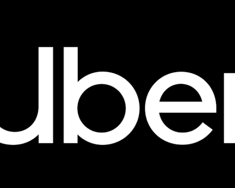
  • Uber has initiated a worldwide “brand refresh”

  • Uber has changed its logo type and app icon and has taken the brand out of its monochrome palette and into a technicolour one

  • The overhaul affects 65 country-markets, including India, and everything from company stationery to marketing communications

Uber initiated a worldwide “brand refresh” on Tuesday. UberThe company has done what people do every day on their app-armed smartphones — update. The six-year-old San Francisco-based firm, valued at $62.5 billion, has updated its brand.

Uber has changed its logo type and app icon and has taken the brand out of its monochrome palette and into a technicolour one. The overhaul, which has been in the works since 2013, affects 65 country-markets and everything from company stationery to marketing communications.

Uber has customised colours and patterns and designed the new brand identity to suit individual markets, a departure from norms among global brands. While most companies practice absolute design consistency, Uber’s negotiating long-established precincts of conventional wisdom.

Indian Uber users might expect to see turquoise, deep magenta, warm amber and fresh blue, and patterns inspired by Indian architecture and fashion the next time they fire up the app.

Shalin Amin, global director of design, product and brand experience at Uber, said in an exclusive chat with ETthat the reason for the makeover is the ride-sharing and taxi aggregator’s growth “from being a single-city based company to one operating in over 350 cities across the world, in a short time.”

The Indian taxi market, estimated at $10 billion. Uber is not the service that works for everyone, everywhere. It faces stiff competition from Bengaluru-based Ola.