In an effort to make it simpler for users to discover new music and videos to view and listen to, Spotify is redesigning the main homescreen of its app. Your homescreen will no longer consist of a collection of record covers but rather a feed that is much more akin to TikTok and Instagram thanks to the new design’s emphasis on imagery and vertical scrolling. Additionally, Spotify wants to make it simpler for you to find new content throughout the Spotify ecosystem as you browse.
The new design, which Spotify recently unveiled at its Play On event, is unmistakably indicative of the type of business (and product) Spotify aspires to be. It has made significant investments in podcasts, ebooks, live audio, and other areas over the past few years in an effort to be more than just a music app. The business aspires to serve as a haven for creators: In 2021, Spotify CEO Daniel Ek expressed his desire for the platform to host more than 50 million “audio artists” in an interview with The Verge. Since it has been pushing video audio for years, Spotify is now mainly observing how YouTube accomplishes it.
All things considered, Spotify is a sizable programme that contains a lot of content. Making it more difficult to listen to music was frequently part of Spotify’s relentless desire to steer users towards more profitable and differentiating content. The new app design appears to be in part intended to provide more specific space for all of those new types of material, which is why. Spotify has spent years trying to figure out how to fit music, podcasts, and other content side by side, but it now appears that the company has realised that giving each item more breathing room is the best solution.
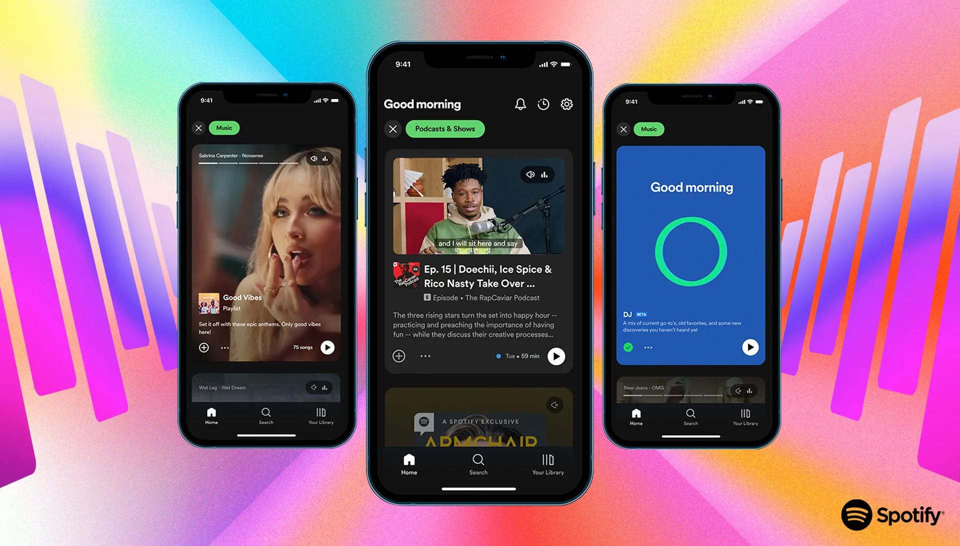
Going forward, the first thing you’ll see when you access Spotify is a collection of album and playlist covers. But underneath, you might see an autoplaying video podcast, which you can launch into with a tap. Or you might see a sizable image in the Instagram manner that provides some additional information about a playlist you might enjoy.
If you select “Music” or “Podcasts & Shows” at the top, you’ll be taken into a vertically scrolling feed that is only for that part of Spotify and resembles Instagram Stories or TikTok much more than the Spotify you’re used to.
You can tap on one to dive in and save or explore it further after flipping through as many as you like, with each one automatically playing to give you a feel of what it is.
There is a clear conflict in the design between Spotify’s desire to make the app a more serene and user-friendly environment and its ongoing search for novel approaches to persuade users to try new things. More autoplaying content than ever before is available in the app, and there are many methods to quickly preview songs and playlists without completely launching them.
Vertical full-screen scrolling is commonplace today and is undoubtedly a helpful tool for finding.
In order to find something they like, billions of users are accustomed to scrolling through a dozen items they don’t like. Additionally, every song, playlist, and podcast has an increased opportunity to capture your attention in this new design.
Playlists have traditionally been Spotify’s primary and sole means of discovery, but the new interface places a lot more focus on introducing you to new music and artists. This is especially true for podcasts, where Spotify is desperately trying to figure out how to earn back the significant investments it has made in the industry. Ek may have acknowledged that he erred in placing such a large wager on novel forms of audio, and the business may have reduced the size of its team working in this area, but that doesn’t mean he’s slowing down.
More individualised Intelligence in Spotify is the other new feature you might have noticed. Don’t forget DJ, the AI spinning records and presenting your own personal radio show. The Smart Shuffle feature, which momentarily adds tracks to your existing playlists, is allegedly an improvement on the “just for you playlist” concept Spotify has been working on for years.
Despite being the leading provider of music streaming, Spotify still has a strong desire to control even more audio. The new design demonstrates that Spotify is no longer a music app and shouldn’t appear as such. It also, ideally, doesn’t appear to be a mish-mash of content.